The District of 100 Mile is keeping its brand as B.C.’s log home capital.
Joanne Doddridge, director of economic development and planning, said the district has updated its website with a new corporate identity icon that “reinforces 100 Mile’s history, location and natural surroundings” but has not changed its official community brand or associated logos.
Council in October awarded Upanup Studios Inc. $60,800 to redesign the district website and $28,300 for the South Cariboo Tourism website to give them with a fresher look and improved functionality.
“This was not a community re-branding exercise. It was a corporate refreshed look for the website,” Doddridge told the Free Press in an email. “It’s important to be consistent in how the District presents itself, so the new website look will also be used in forms, applications and other corporate print materials.
“We do not intend to replace our signage or create new tag lines for 100 Mile House.”
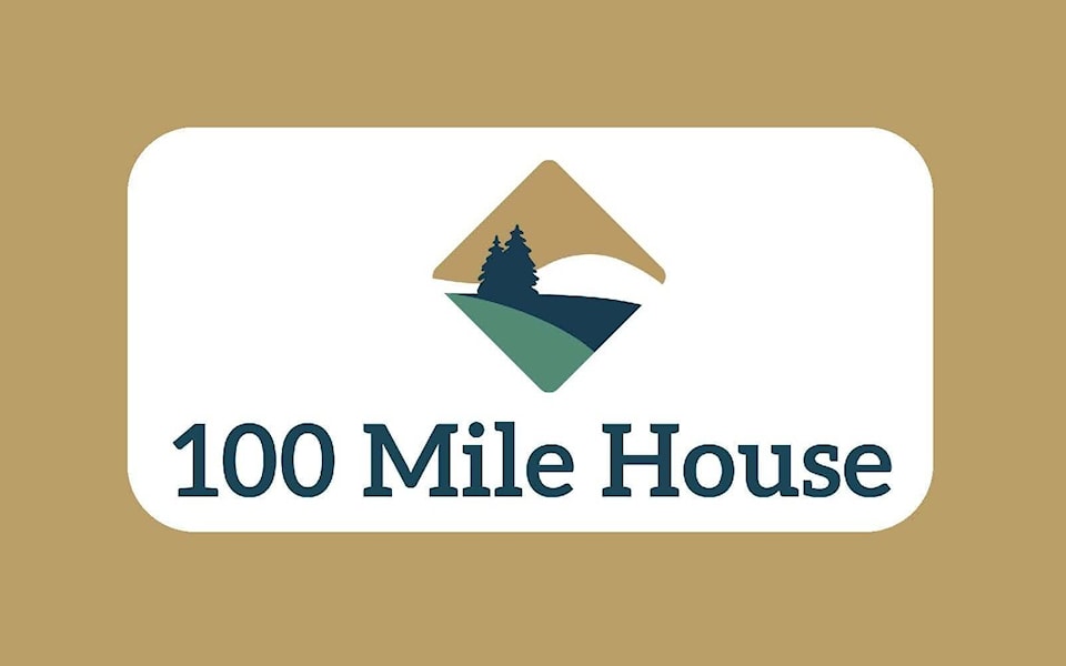
Doddridge acknowledged the district has received mixed reviews about the new corporate identity icon, which represents 100 Mile House by retaining the green and gold colours in the District’s Coat of Arms but in a more muted colour palette to represent nature and appear rustic and serene. She added the icon is a diamond shape that represents a house - the top of the icon being a triangle. The diamond also resembles a road sign that represents Highway 97 – 100 Mile House being the well-known stopping place.
Doddridge noted the previous website hadn’t been updated in a long time, and no longer met accessibility standards or user expectations. One of the first decisions in developing the new site was determining what kind of look and feel should it have.
“We’re excited about the new website, which is proving to be more efficient in providing easy-to-use services to residents and businesses. The investment / economic development pages have been enhanced, and the site generally is clean and clear, accessible, and easy to navigate.”
She added the District has used several symbols over the years, and all of them are still in use in some form or another such as the crest, stagecoach, log home and wagon wheel. Any community rebrandings, should they occur in the future, would include public consultation with District Council.
@ksinoski
kelly.sinoski@100milefreepress.net
Like us on Facebook and follow us on Twitter.